10 Childcare Website Design Elements That Build Parent Trust
Ten childcare website design elements build parent trust more reliably than any other investment you can make in your online presence: a tap-to-call bar, a readable headline, real photos, licensing proof, staff credentials, tuition transparency, a tour booking path, a fast inquiry form, mobile load speed, and conversion tracking. But here is what most design galleries miss entirely. A beautiful website that cannot move a parent from first glance to scheduled tour is not a marketing asset. It is a brochure. Most childcare owners searching for website inspiration end up with a list of pretty examples and no idea which elements actually drive enrollment, which ones to prioritize on a limited budget, or how to measure whether any of it is working.
Here is what the research and our work with childcare centers across the U.S. consistently shows:
A sticky mobile bar with click-to-call and a tour button is the single highest-impact element on most childcare sites today.
Licensing numbers and safety credentials placed near your inquiry form reduce parent hesitation at the exact moment they are deciding whether to reach out.
Tuition ranges on your site prevent the low-trust silence that happens when parents cannot find basic pricing and move on to a competitor.
Tour booking automation keeps your enrollment funnel moving even when your front desk is handling a room full of children.
Tracking tour conversions, not just inquiry volume, is the only way to know whether a design change is actually growing enrollment.
At BRIT Childcare, we work exclusively with childcare centers, preschools, and Montessori schools, and we see the same pattern repeatedly: owners invest in a redesign, get a site that looks polished, and still watch inquiries go cold before a tour is ever booked. Our Enrollment Engine is built specifically to close that gap, connecting your website to automated follow-up, tour scheduling, and funnel tracking so every design element is pulling toward one outcome: a family seated in your center.
The place most childcare websites lose parents first is not the homepage headline or the color palette. It is the moment a parent on a mobile phone cannot find a way to call or book a tour in under two seconds.
That is exactly where we start.
1. A sticky mobile bar that makes calling and tours one tap
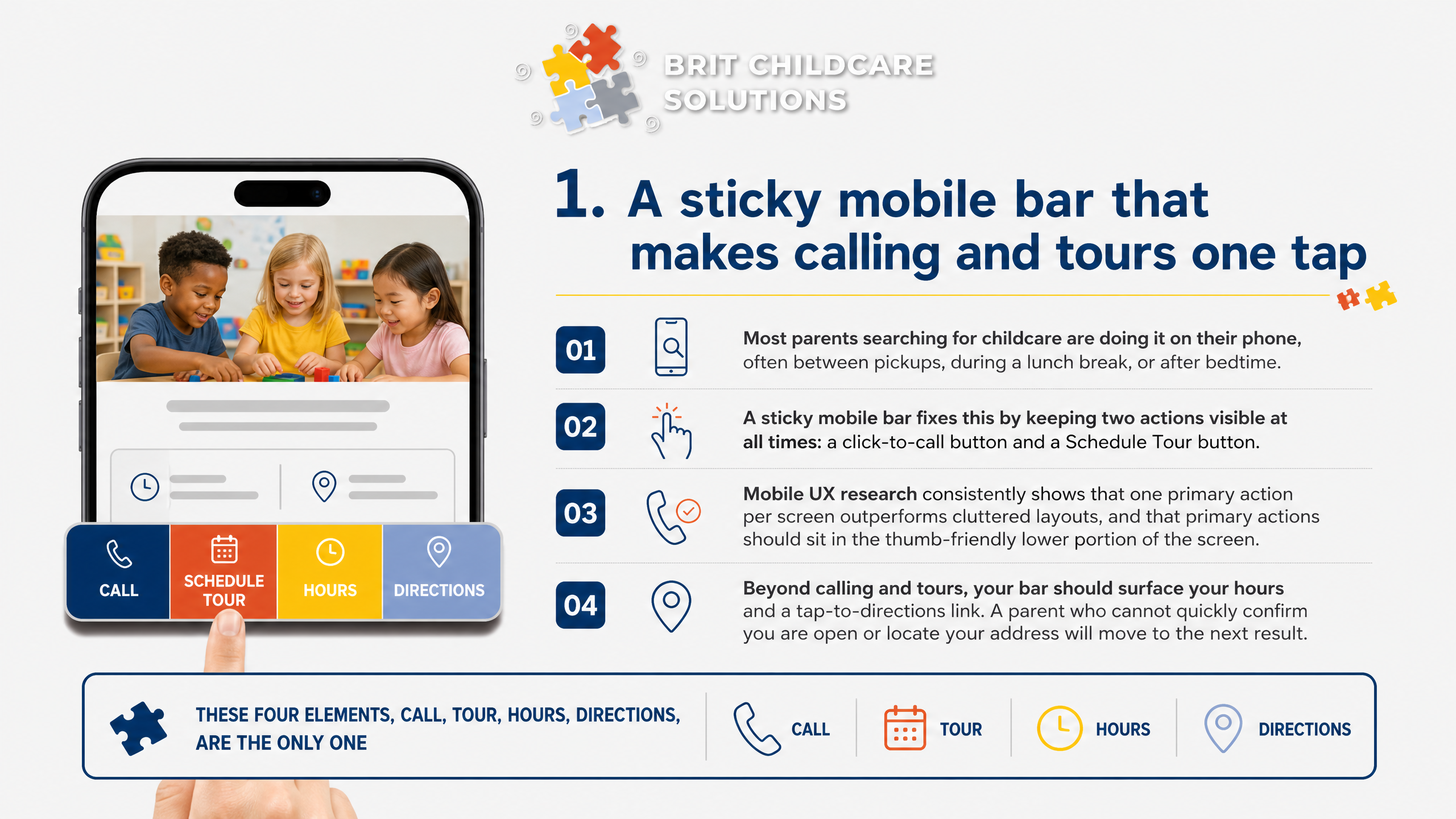
Most parents searching for childcare are doing it on their phone, often between pickups, during a lunch break, or after bedtime. If your website makes them hunt for a phone number or scroll past three sections to find a tour button, you have already lost them. A sticky mobile bar fixes this by keeping two actions visible at all times: a click-to-call button and a Schedule Tour button.
Mobile UX research consistently shows that one primary action per screen outperforms cluttered layouts, and that primary actions should sit in the thumb-friendly lower portion of the screen. Apply that directly: your sticky bar should show your phone number on the left and your tour booking link on the right, nothing else competing for attention.
Beyond calling and tours, your bar should surface your hours and a tap-to-directions link. A parent who cannot quickly confirm you are open or locate your address will move to the next result. These four elements, call, tour, hours, directions, are the only ones that belong in that bar.
Keep it clean, keep it fixed, and watch your inquiry rate reflect it.
2. A homepage headline that is readable in one glance
Your hero headline is the first thing a parent reads, and if they cannot read it instantly, they leave. The most common failure we see is beautiful photography with text layered directly over it. Busy backgrounds, dappled light, colorful murals behind white text, these combinations destroy readability regardless of how strong the message is.
The fix is straightforward. Place your headline on a solid color block, a semi-transparent overlay, or a clean section separate from the image entirely. WCAG accessibility standards require a minimum contrast ratio of 4.5:1 for normal text, and meeting that threshold is not just a compliance detail. It is the difference between a parent absorbing your message in one glance and bouncing to a competitor who made it easier.
Beyond contrast, your headline must answer three questions immediately: What ages do you serve? Where are you located? What should I do next?
A headline like 'Nurturing Young Minds' answers none of them. 'Enrolling Infants Through Pre-K in Austin, TX' answers all three. Parents searching for childcare are comparing multiple options quickly, often on a phone during a lunch break. Give them the information they need before they have to scroll or hunt.
3. Real photos that prove you are a real place
Parents cannot tour your center before they trust it enough to inquire. Real photography closes that gap faster than any headline you write. Show the actual classrooms, the playground equipment, the cubbies, the reading corners.
Generic stock photos of smiling children in pristine rooms signal nothing about your specific environment, and parents notice the difference immediately.
The most effective photos capture staff in motion: a teacher kneeling beside a child working through a puzzle, a director greeting a family at the door. Posed group shots feel like a brochure. Candid interaction shots feel like evidence.
That distinction matters because parents are not evaluating aesthetics; they are evaluating whether their child will be safe and engaged in your care.
Privacy-safe practices are non-negotiable. Before publishing any photo featuring a child, confirm you have signed photo release consent on file for every family shown. Many centers photograph environments and staff only, using children's artwork, hands, or back-of-head angles to add warmth without exposure.
Place these images near your inquiry form and on your homepage, not buried in a gallery tab. Trust signals work hardest when they appear exactly where parents are deciding whether to reach out.
4. Licensing and safety proof placed next to the inquiry path
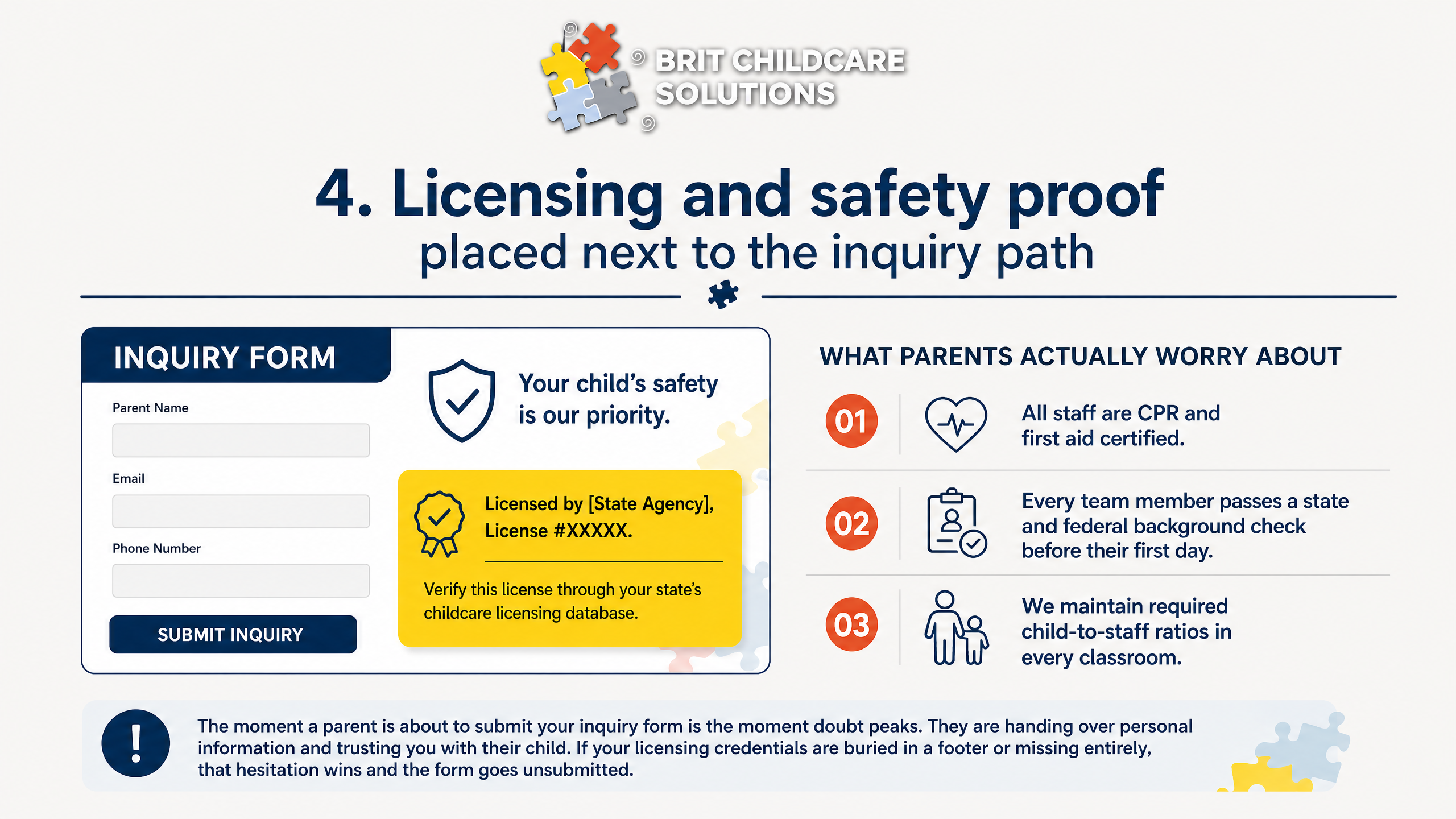
The moment a parent is about to submit your inquiry form is the moment doubt peaks. They are handing over personal information and trusting you with their child. If your licensing credentials are buried in a footer or missing entirely, that hesitation wins and the form goes unsubmitted.
Place your state license number directly beside your inquiry form, along with a plain-text note telling parents exactly how to verify it through your state's childcare licensing database. You do not need a badge or a graphic. A single line that reads 'Licensed by [State Agency], License #XXXXX' does the job.
Parents who want to verify will know what to do with it.
Below that, add three short trust statements covering what parents actually worry about:
These do not need to be long. A single sentence each is enough. 'All staff are CPR and first aid certified.' 'Every team member passes a state and federal background check before their first day.' 'We maintain required child-to-staff ratios in every classroom.' Short, direct, and specific.
If your center has passed its most recent state inspection without violations, say so. 'Most recent state inspection: no violations cited' is a credibility statement most competitors will not make because most do not think to include it. That transparency signals confidence and separates you from centers that leave parents guessing.
5. A staff section that reduces fear of turnover and supervision
Parents do not read long bios. But they do notice a face, a name, and a credential placed near your inquiry form. Your director's photo should appear on the homepage or a dedicated staff page with three things next to it: her name, her early childhood education credential or degree, and how long she has been with your center.
That combination answers the turnover question before a parent has to ask it.
Below the director, keep teacher highlights brief and scannable. List tenure ranges, training certifications like CPR and First Aid, and any state-required credential hours. A line that reads 'Our lead teachers average six years with us' communicates stability far more effectively than a paragraph of polished copy.
The supervision question is one parents carry but rarely voice out loud. Answer it directly on the page. Name who is responsible for classroom oversight, and make clear who a parent calls or emails when a concern comes up.
A visible name and contact path signals accountability. That transparency is what moves a hesitant parent from browsing your site to booking a tour.
6. Tuition and availability cues that prevent low-trust surprises
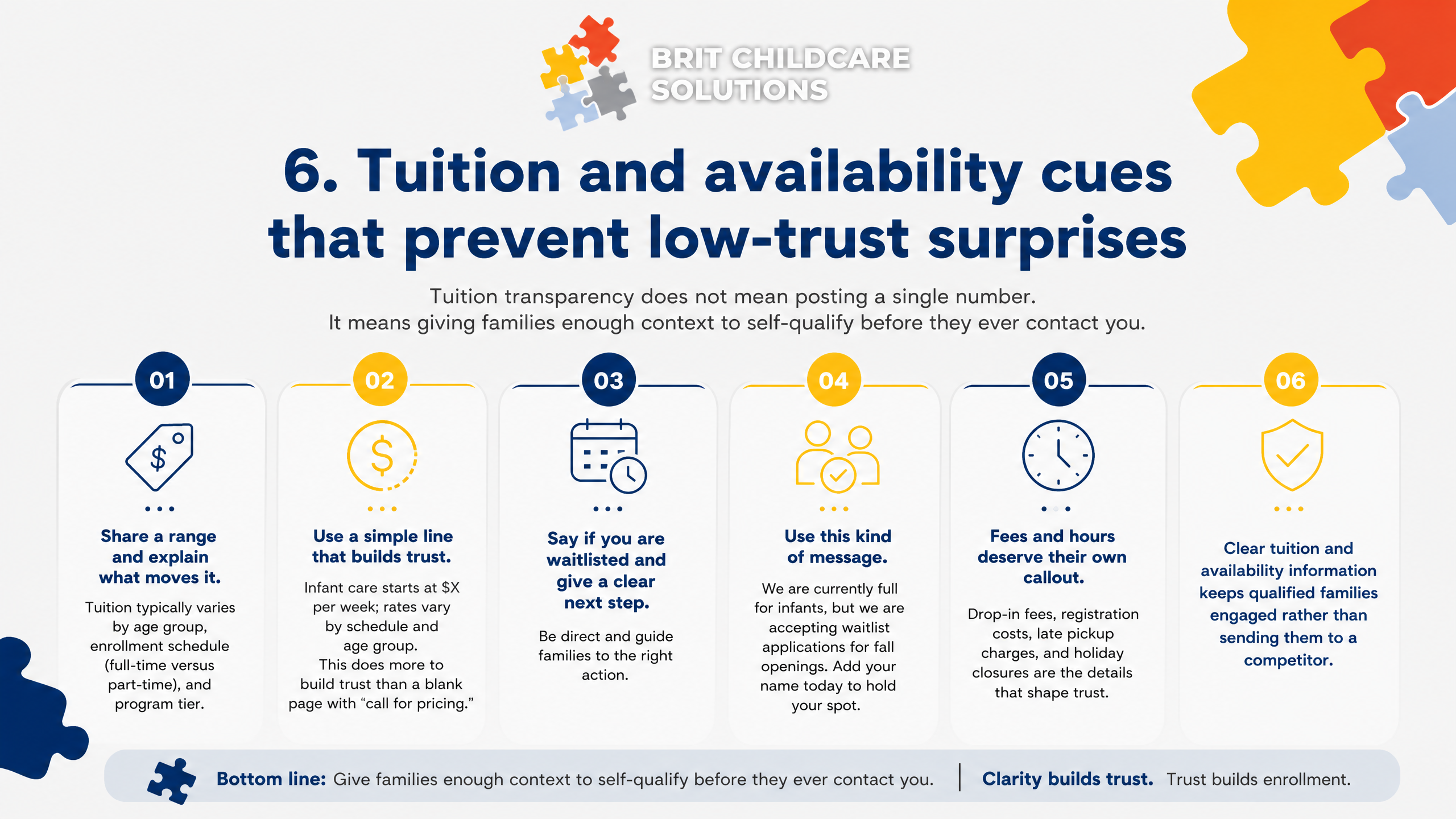
Parents who hit a pricing page and find nothing often assume the worst and move on. Tuition transparency does not mean posting a single number. It means giving families enough context to self-qualify before they ever contact you.
Share a range and explain what moves it. Tuition typically varies by age group, enrollment schedule (full-time versus part-time), and program tier. A simple line like 'Infant care starts at $X per week; rates vary by schedule and age group' does more to build trust than a blank page with 'call for pricing.'
If you are currently waitlisted, say so directly and give families a clear next step. Something like 'We are currently full for infants, but we are accepting waitlist applications for fall openings. Add your name today to hold your spot.' That message keeps qualified families engaged rather than sending them to a competitor.
Fees and hours deserve their own callout. Drop-in fees, registration costs, late pickup charges, and holiday closures are the details that create friction after a tour. Listing them upfront signals honesty and reduces the back-and-forth that slows enrollment decisions.
Families who know exactly what to expect show up to tours ready to commit.
7. A tour booking path that works even when your front desk is busy
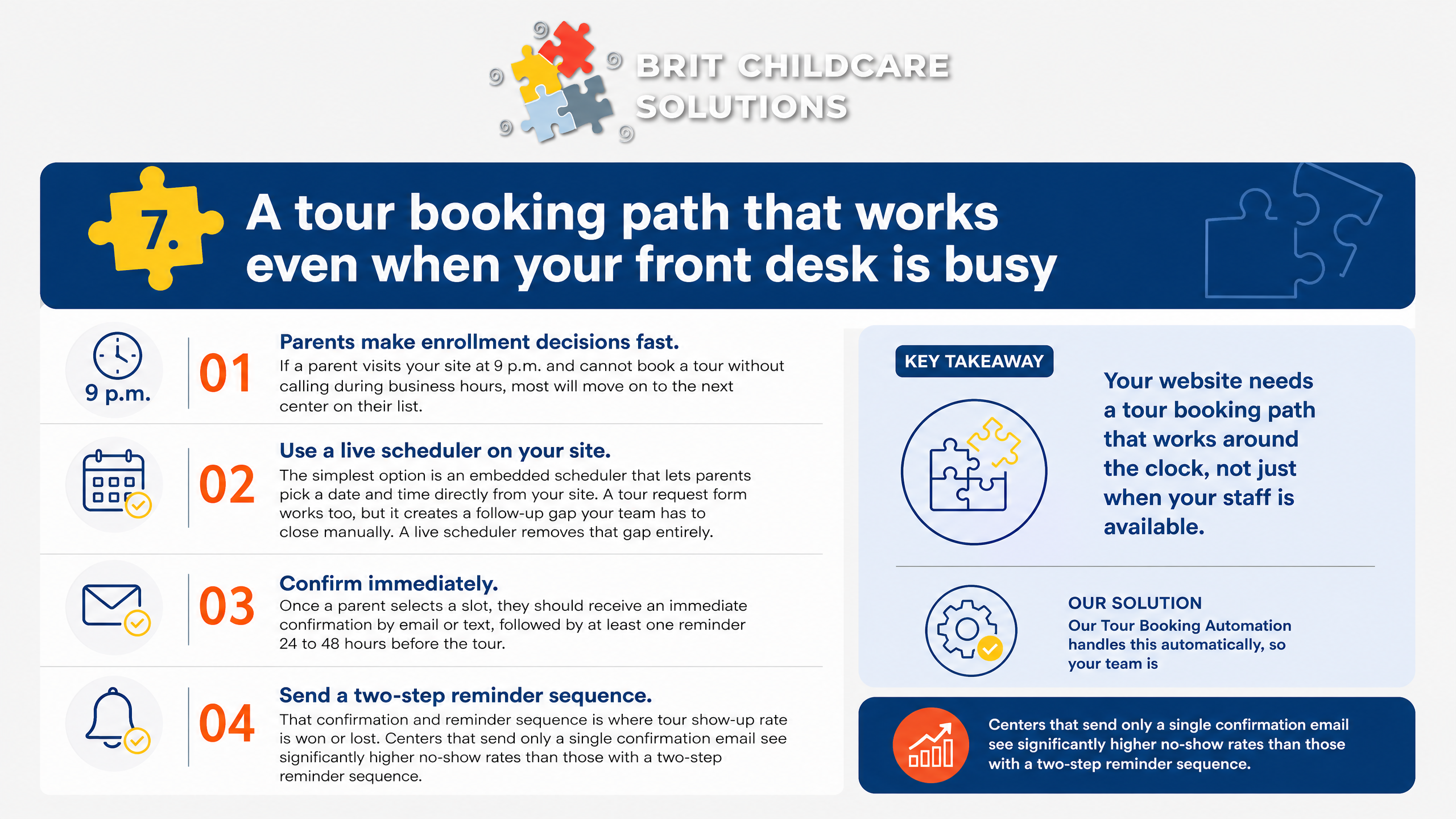
Parents make enrollment decisions fast. If a parent visits your site at 9 p.m. and cannot book a tour without calling during business hours, most will move on to the next center on their list. Your website needs a tour booking path that works around the clock, not just when your staff is available.
The simplest option is an embedded scheduler that lets parents pick a date and time directly from your site. A tour request form works too, but it creates a follow-up gap your team has to close manually. A live scheduler removes that gap entirely.
Once a parent selects a slot, they should receive an immediate confirmation by email or text, followed by at least one reminder 24 to 48 hours before the tour.
That confirmation and reminder sequence is where tour show-up rate is won or lost. Centers that send only a single confirmation email see significantly higher no-show rates than those with a two-step reminder sequence. Our Tour Booking Automation handles this automatically, so your team is not chasing down families the morning of a scheduled visit.
Shift your mindset from booking tours to protecting them. Every parent who schedules and does not show up represents a real enrollment opportunity lost. A well-designed booking path paired with automated reminders is one of the highest-return improvements you can make to your enrollment funnel, and it costs your front desk nothing extra.
8. An inquiry form built for speed, privacy, and follow-up automation
Your inquiry form is where interest either converts or disappears. Most childcare websites bury a long form at the bottom of a contact page and wonder why families never complete it. Form optimization research confirms that each additional field reduces completions by 3 to 5 percent, so keep your tour booking form to the essentials only.
To schedule a tour, you need four fields at most: parent name, child's age or birth date, preferred tour date, and a phone number or email. That is enough for your team to confirm the appointment and prepare for the visit. Everything else, program preferences, specific questions, how they found you, can be gathered during the tour itself.
Privacy copy matters more than most owners realize. Parents are sharing their child's information, and they notice when a form feels careless. A single line beneath the submit button stating that their information is kept private and used only to schedule their visit goes a long way.
If your center uses a CRM or third-party tool to store inquiries, name it briefly and note that data is never sold.
Automation readiness is what separates a form that generates tours from one that generates stale inquiries. The form should route submissions instantly to the right staff member by location, trigger an automated confirmation text or email within minutes, and flag any inquiry that has not received a response within a set window. Our Enrollment Engine connects directly to this routing layer, so no inquiry sits unanswered while your front desk handles the morning rush.
9. Load speed and mobile layout that prevent silent drop-offs
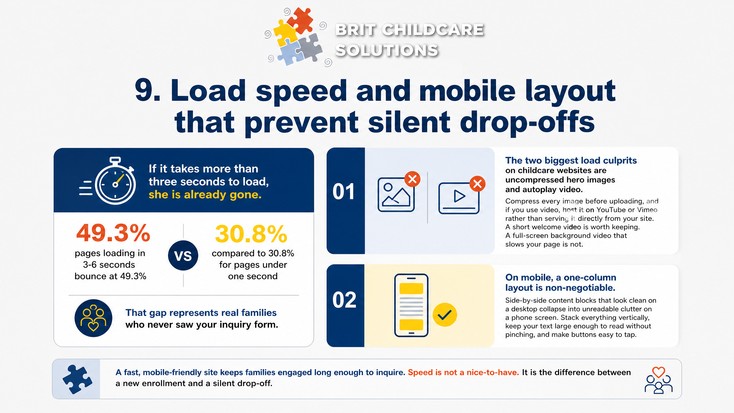
A parent finds your site on her phone during a lunch break. If it takes more than three seconds to load, she is already gone. According to 2026 bounce rate data, pages loading in 3-6 seconds bounce at 49.3%, compared to 30.8% for pages under one second.
That gap represents real families who never saw your inquiry form.
The two biggest load culprits on childcare websites are uncompressed hero images and autoplay video. Compress every image before uploading, and if you use video, host it on YouTube or Vimeo rather than serving it directly from your site. A short welcome video is worth keeping.
A full-screen background video that slows your page is not.
On mobile, a one-column layout is non-negotiable. Side-by-side content blocks that look clean on a desktop collapse into unreadable clutter on a phone screen. Stack everything vertically, keep your tour booking button sticky at the top or bottom, and eliminate any element a parent has to pinch-zoom to read.
Tap targets matter more than most owners realize. Buttons and links need to be large enough to tap without frustration, and text needs enough contrast to read in bright sunlight. These are not cosmetic details.
They are the difference between a parent who books a tour and one who quietly moves on to the next center.
10. Simple tracking that ties design changes to tours and enrollments
A redesigned website means nothing if you cannot prove it moved the needle. Without a scoreboard, you are spending money on aesthetics and hoping for the best. The three numbers that actually tell you whether your design is working are your inquiry-to-tour conversion rate, your tour-to-enrollment conversion rate, and your average response time to new inquiries.
Your inquiry-to-tour rate tells you how many families who contact you actually schedule a visit. If 100 families fill out your form and only 12 book a tour, your design may be creating friction at the form, or your follow-up is too slow. A well-designed inquiry path paired with automated response should push that rate meaningfully higher.
Our clients who implement fast, automated follow-up consistently see this number climb because parents get a reply in minutes, not hours.
Your tour-to-enrollment rate closes the loop. If families tour but do not enroll, the website is not the problem. But if they never make it to a tour, the design and the follow-up system are both worth examining.
Response time benchmarking is the piece most owners overlook entirely. Parents searching for childcare contact multiple centers at once. The center that responds first wins the tour most often.
Track how long it takes your team to reply to a new inquiry, and set a target of under five minutes using automation. Once you have these three numbers, every design change you make has a before-and-after story you can actually measure.
How to choose DIY, a freelancer, or a childcare specialist
Before you sign anything or spend a dollar on a redesign, ask three questions: What deliverables are included? Does the scope cover CTAs, inquiry forms, and conversion tracking? And how will you measure success?
If the answer to success is 'a better-looking site,' walk away. The right metric is tour bookings per month, not compliments on your color palette.
DIY builder when stakes are low
A DIY builder works when you have a single location, inquiries are already coming in steadily, and your main goal is a cleaner online presence rather than a full enrollment recovery.
Platforms like Wix or Squarespace launch faster than a custom build and require no developer. The trade-off is limited customization, so you need to be disciplined about what you implement.
Item 1: A tap-to-call bar and sticky tour button visible on mobile
Item 7: A fast, low-friction inquiry form (three fields maximum)
Item 8: Basic conversion tracking so you know which pages drive contact
If you skip these three, a polished DIY site will still underperform a plain one that captures inquiries correctly.
Freelancer when you can manage follow-up
A freelancer is a solid middle path when you already own your copy and photos, have a clear scope written down, and can manage inquiry follow-up yourself once the site goes live.
Set firm timelines upfront and confirm the freelancer will run mobile QA across real devices, not just a desktop preview. Slow mobile load and broken forms on iPhone are the two most common reasons a newly redesigned site still fails to convert.
Childcare specialist when enrollment is leaking
If you operate multiple locations, run inquiry routing manually, or have watched families inquire and then disappear before ever touring, a childcare specialist is the right investment.
Multi-location sites require routing logic that sends each inquiry to the right center automatically. Add tour booking automation and reminder sequences, and your show-up rate improves without adding staff hours.
Measure success by cost per enrolled seat, not cost per click or total leads. That single metric tells you whether your website is functioning as an enrollment system or just generating noise. Our Enrollment Engine ties website inquiry capture directly to automated follow-up and funnel tracking so you can see exactly where families drop off and fix it.
Your Website Is the First Step.
Your Enrollment System Is What Fills Seats.
Every element in this article points to the same truth: your website is not a brochure. It is the first moment a parent decides whether to call, book a tour, or quietly move on to the next option. Getting the design right matters.
But design alone does not fill open seats.
What happens after a parent taps your tour button is just as important as the button itself. Response speed, follow-up consistency, tour reminders, and conversion tracking are what turn a well-built site into a reliable enrollment engine.
That is exactly what we build at BRIT Childcare. Our Done-For-You Enrollment Management Service connects your inquiry capture to automated follow-up, tour booking, and enrollment funnel tracking so nothing falls through the cracks, whether you run one location or several.
If you are ready to stop guessing and start measuring tours booked and enrollments filled, book your BRIT Childcare Enrollment Engine website and conversion review. We will map out exactly where your inquiry path is leaking and what to fix first. Schedule your strategy call today at britchildcare.com/work-with-us.
